My First Picture's- Unedited
Model: Char Ranson

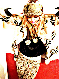
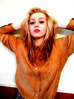
My first set of pictures was quite successful, the only issue being my background. Despite hanging white sheets and drapes over areas in which the pictures were being taken, it often caused problems. The pictures themselves proved somewhat successful, meeting the criteria for my genre. My model wore clothes that seemed to correlate quite well with the 'indie' look presented within my genre. I have decided to use these pictures as my content pictures most likely. As the cover/double page spread model I had already decided.
Below are my first unedited attempts.
This picture was one of the first taken, the red dress is featured throughout. Despite liking this pose, the outfit didn't work as well for my genre as I'd previously hoped. In the corner we can see that the drape has fallen, and it would therefore have to be edited out. I like the colours as they seem dramatic and bold. I doubt this one shall be used for my magazine.
I really like the look created here, but there are other photos featuring it that I liked a lot better.
This picture is a bit blurry and the composition and framing did not compliment the model to her full potential.
I prefered this one to the last she looks innocent and her posing compliments her a lot more. As said before I really like the outfit she is wearing as
it relates more to my chosen genre.
I wasn't overly keen on this picture,
it lacked good positioning, pose or angle. It looks quite dull and doesn't compliment the model as much as many of the others.
I liked this picture as it shows off the model's features. They are very soft and feminine and
reflects the laid back look I want to portray throughout my magazine.
I like the pose presented here by my model, she has a somewhat innocent look on her face
exaggerated by her big features and long hair. The bare amount of makeup she is wearing adds to this. The only thing is that I don't think it is dramatic enough to make an impression and also you can see the door in the background.
Here her hair is wild and would therefore
be really difficult to edit, it is too close up to be really effective as a cover as it would be
too clustered and the writing would be hardly seen.
I love the outfit and pose on this photo, I think the framing suits the models face and her outfit here really compliments her. The background needs editing though, and this may be difficult to do, her hair often seems to pose a problem.
The door in the framing seems to ruin the overall picture. But despite this I like the pose and angle of this picture. It's not centred and this difference and pose,
portrays the indivduality that the 'indiie/alternative' genre presents.
This is much the same as the last, but the pose is less effective and once again the background works against the picture. Also her facial features and gaze were not focused upon/framed in the best manner to portray the look I want.
Here I feel her facial expression looks to fake, this may be better used in a fashion type magazine, but for music attitude and charisma is needed, to be captured in the moment will work better to present the idea of being lost in good music.
Personlly I loved this picture, I feel the framing, angle and position worked really well here but for the photo I wanted to include I wanted a more innocent and subtle approach whereas this picture feels more aggressive and outspoken

Above as already told are all my originals, none of which are edited. The powerpoint below explains my goals and the editing methods. For the below pictures I was merely testing out my editing skills and will most likely not use any of the original edits I've created. I have used microsoft powerpoint to create the below presentation.
Below are some more of my photos of Charlotte
 My Chosen Photo


